Observing the markets from a long time, I have seen a very peculiar thing which I am going to explain. This is a hypothesis which could fundamentally explain many technical chart patterns which are already used in market to predict price movements, viz.:
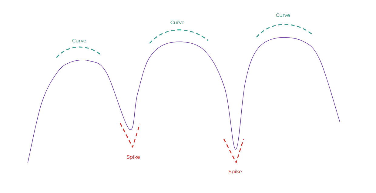
Do you see anything common in all the above formations? I do.
To gather the concept, let’s understand how a ball moves when thrown:
The movement is a combinations of ‘spikes’ and ‘curves’. Note that the spikes point in the direction of gravity, while curves form against it.
Now the thing is to apply the same concept of ball movement to price movement in markets.
First step is to figure out the direction of gravity. From the above, it’s definitely the one where spikes point.
Now a stock will finally move in the direction of gravity.
Let’s apply the concept to different pre-existing chart patterns:
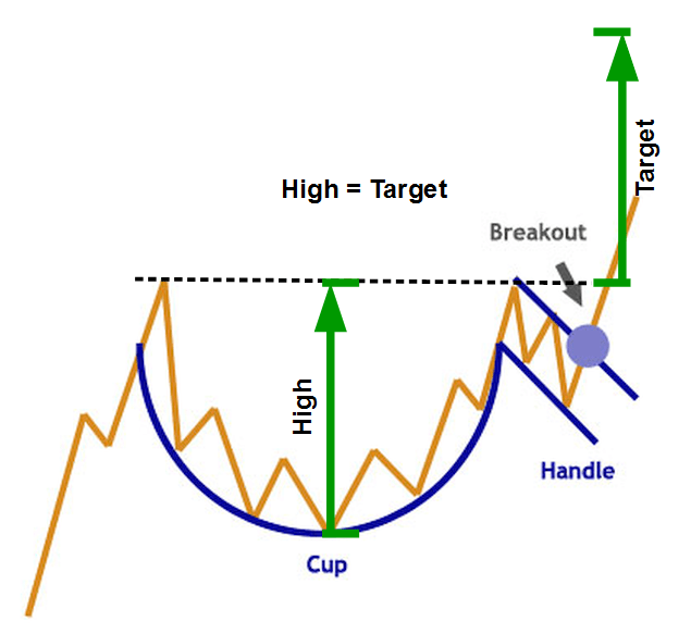
Ideal Cup & Handle Pattern
Notice that the spikes are pointing upwards, which is where gravity lies. Which means that stock moves up ultimately.

Spikes are visible downwards, supports the concept.
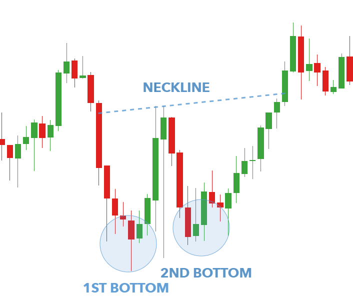
Double Bottom Pattern